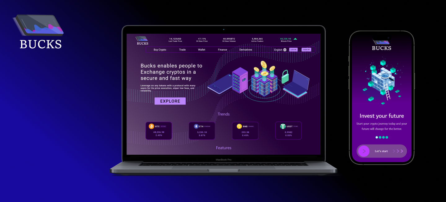
The Product
Bucks is a Cryptocurrency exchange website with a modern feel that attempts to make buying, selling, and exchanging crypto coins easy for users with little to no knowledge about crypto nuance.
Project Duration
April 2022 to June 2022
The Goal
Design an app for users who want to exchange cryptocurrencies with modern approaches.
My Role
UX designer designing an app which named Bucks.
Responsibilities
Creating user-centered designs by understanding business requirements, User research, conducting interviews, and user feedback. Creating user flows, wireframes, Low and High fidelity prototypes, usability testing and studies and factoring accessibility in design and mockups.
I conducted interviews and created empathy maps to understand the users I’m designing for and their needs. A primary user group identified through research was working adults who want to exhange and trade cryptocurrencies.
As a result of interviews, it is understood what pain points users had and how they feel.
Navigation
Most cryptocurrency websites are usually stresful to navigate through and not user friendly
Accessibility
Some have accesibility issues and users often need extra help to understand certain terms used on the platform
Security
Some users have been hacked in the past which effectively stopped them from securely trade crypto as well as use them for everyday payment
Age: 25
Education: International Marketing
Hometown: California, USA
Family: Single
Occupation: Marketing Lead
Goals:
Getting financial Independence

Frustrations:
Feeling overwhelmed with poor design and messy user interfaces.
David is a marketing lead who is passionate about upskilling but still cope with to understand how he could have financial independence. He thinks crypto markets and blockchain technology will be the future for next generations.
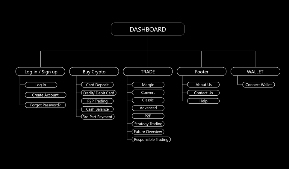
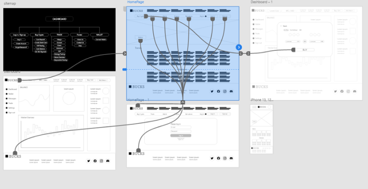
The goal was to make the journey seamless for users and so, I came up with an information architecture that would make the user experience a beautiful experience.
The low-fidelity prototype connected the primary user flow of building and exchanging, so the prototype could be used in a usability study with users.
View the Bucks
low-fidelity prototype.
I conducted two rounds of usability studies. Findings from the first study helped guide the designs from wireframes to mockups. The second study used a high-fidelity prototype and revealed what aspects of the mockups needed refining.


Users want to see currency values directly
Users want to use responsive charts
Users want user friendly interface
The main page should clear with the currency values
Popular currencies should be monitored easily
Early designs allowed for some customization, but after the usability studies, I fixed spacing, some typos and consistency of structure.

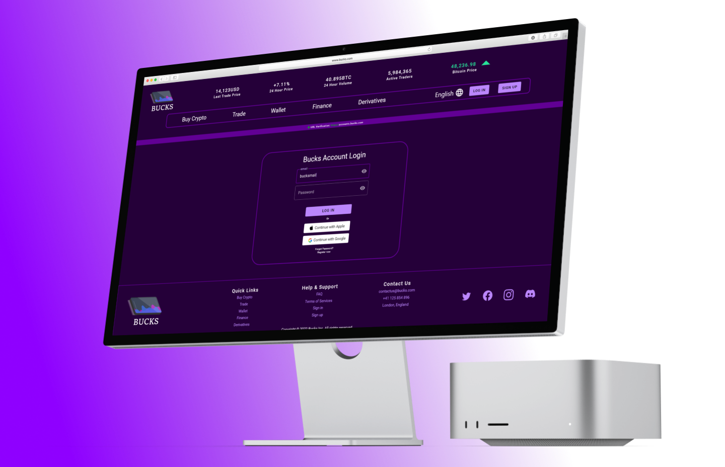
Provided access to users who are vision impaired through adding alt text to images for screen readers.
Used icons to help make navigation easier.
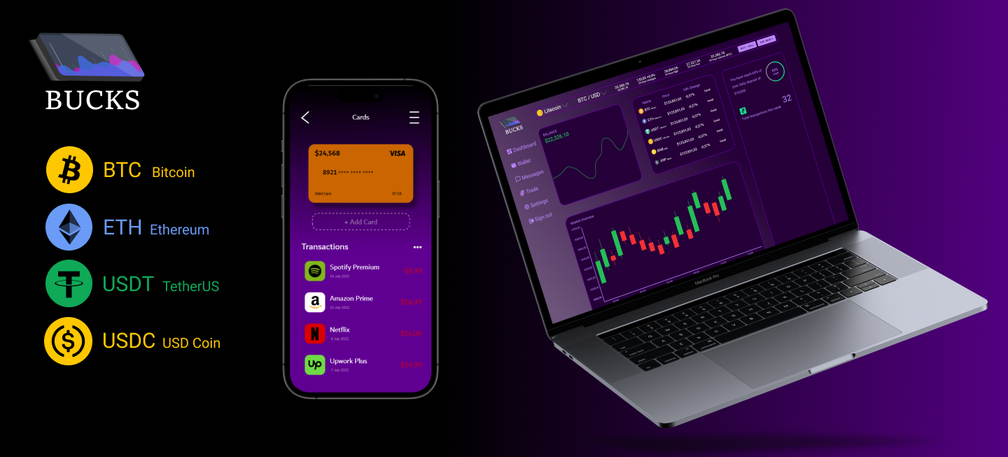
Used detailed imagery for products to help all users better understand the designs.
Thank you for your time reviewing my work on the Bucks Website!
If you would like to see more or get in touch!
.png)